A few weeks ago EA and DICE (of former Battlefield glory) unveiled their newest title in development for the PS3/360, Mirror’s Edge. It’s the kind of game that jumps out immediately in the crowded next-gen market with too many me-too titles. It’s the kind of title that makes you angry — not because it exists — but because it exists and you weren’t the developers who came up with the idea first.

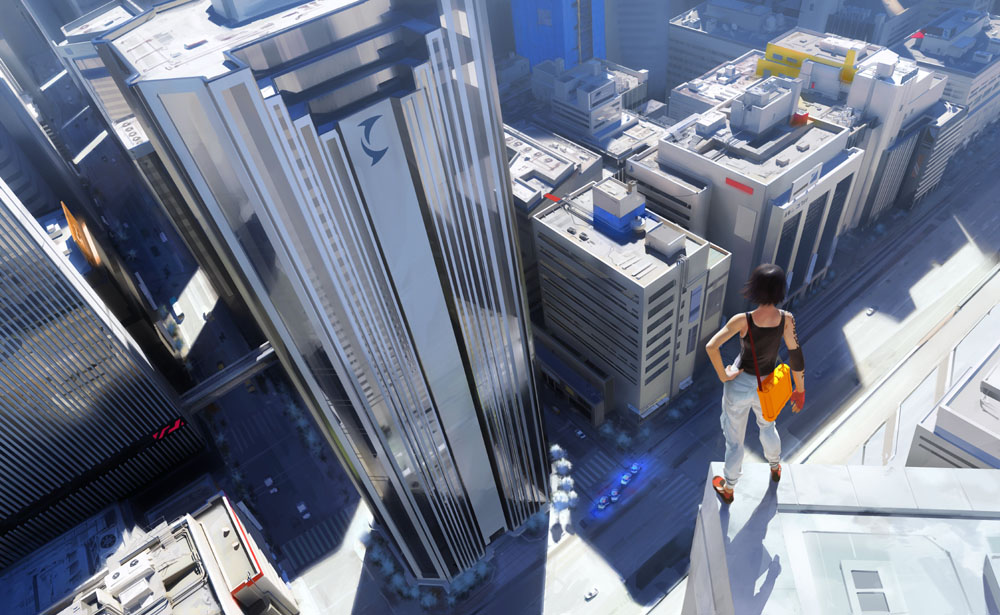
Faith (yes, that’s her name) and the city of Mirror’s Edge (not the actual city name)
For anyone who hasn’t seen the trailer yet, I urge you to view it in HD at GameTrailers.com. The trailer demonstrates a simulated gameplay experience showing off the core concepts of the game. Running, sliding, and the use of momentum and proper acceleration to overcome obstacles be they inanimate or human. Also included is an awesome tune that pretty much makes the trailer.
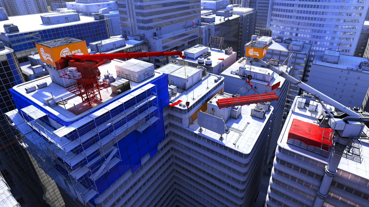
One aspect of the game that immediately jumps out is the beautiful spartan art style employed on the architecture of the city. The simple color scheme with highlights various objects with a few bright colors among a lot of white is a welcome change from the typical grim and dirty realism that most FPS games strive for nowadays. The color scheme however isn’t just for giving Mirror’s Edge a unique look amongst a sea of derivatives, but also represents a smart way to accentuate important gameplay aspects of the city in this parkour-inspired game. From an interview with MTV’s Multiplayer blog:
Multiplayer: Is that the visual design? No green?
O’Brien: Well, the visual design isn’t that we targeted green to take it out. The art direction grew out of the gameplay. We wanted to give people a sense of the world very quickly and move through it very quickly. We initially stripped out all of the colors and then just put in red [to guide people to objectives]. But we needed more colors to break it up

How does anything get done in a city with a population of one?
I hope the use of colors to illustrate potential paths is just the first step DICE made in developing Mirror’s Edge. Various screenshots lead me to believe this is true. Note how both in various images for the game and the trailer (which I know you’ve seen by now) seems to consistently highlight certain objects using specific colors. Red is the most obvious and striking. In the trailer red is used on ramps that are to be jumped, pipes to tightrope walk or grab onto, doors to kick down, and other objects which scream “action”. Blue and oranges seem to be more general colors highlighting areas that would be useful for running, jumping, or sliding to quickly advance through the city. Even the color green makes two brief appearances in the trailer coloring the car in the city and the rail that Faith is using to avoid detection during the montage making green a “stealth” color.
The development of Mirror’s Edge lends credence to John Riccitiello’s claim that EA has moved on from its homogenized, sports-and-licensed-properties-only past and is now fully supportive of developers crafting their own unique games. Mirror’s Edge and Dead Space this year along with such titles from last year like skate show EA are all promising signs of a more mature company that understands the need to balance their portfolio with both original fare and licensed games/sequels. Titles like Mirror’s Edge are still multimillion dollar ventures that other studios can only dream of matching, but instead of being typical generic titles that litter this industry the gameplay ideas are both different and innovative. EA is taking actual risk when they support games like Mirror’s Edge and I for one can only hope these gambles pay off for them in significant ways.
Leave a Reply